When Chris and I bought our first home in May of 2010, we got very lucky and ended up with a beautiful little gem of a house that really didn't need much work. There was one exception, the one main bathroom, it needed a complete overhaul. It was very small, it was awkward and though it was clean, it always looked a bit grungy (see for yourself in these before shots.) We spent the first two weeks of May working like crazy with our wonderful contractor Greg. When Greg left after two weeks, our new bathroom was almost done, all we needed was a mirror and a few accessories... three months later, and a mirror finally went up. Our bathroom reno is done!
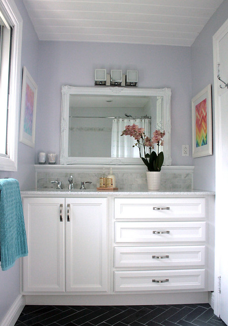
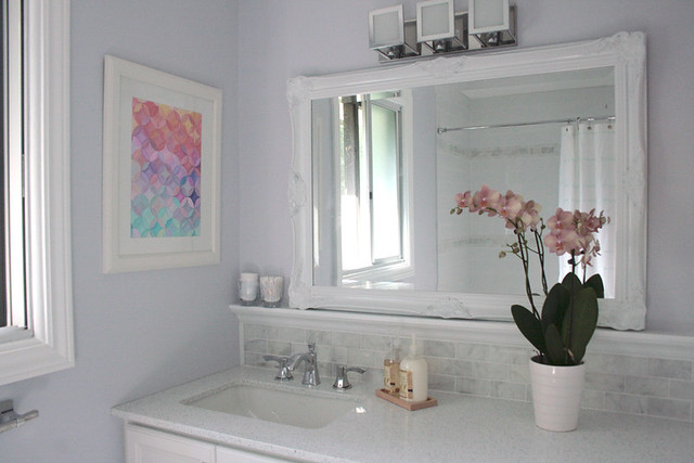
The bathroom is by no means huge, but by knocking down a wall and borrowing two extra feet from the second bedroom we were able to install a large, built-in vanity with tons of storage space and a beautiful wall to wall countertop. We placed the square sink off center, this made the most sense for us because it allowed us to fit in all those wide drawers, and it makes it a lot easier for more than one person to be in the space at once. Chris could brush his teeth in front of the sink, while still allowing me access to the drawers to get at my all my products.
A few of the many details:
* Instead of dry-walling the ceiling we chose to install pine that we then painted white, I think it adds character to an otherwise pretty crisp space. Plus, our kitchen and office have bead-board ceilings so it ties in with the rest of the house nicely.
* The floor is black slate installed in a herringbone pattern, and it's heated! Love it.
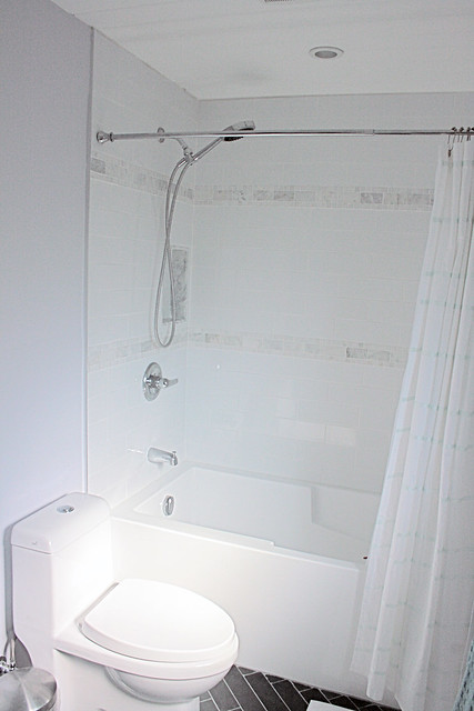
* We used an exaggerated white subway tile (4x16) in the shower, accented with a hint of carrera marble in the form of two 4" high stripes made up by stacking 1x1 tiles on either side of a 2x4 tile. I love carrera marble, but we certainly did not have the budget to build a marble bathroom, I'm happy to have purchased the tiles at a discount tile warehouse, and have used them sparingly. It makes the hits of marble feel very special to me.
* The countertops are Silestone, we chose this material because its beautiful, its a bit sparkly as its made from recycled glass and stone, and I'm told its practically indestructible! (ours is called White Diamond and is from the eco series.)
* The walls are painted the prettiest shade of lavender/grey, depending on the light they sometimes look like a cool mauve, or a soft grey. The colour is called Frost by Martha Stewart.
* The paintings that I did for the bathroom add a lot of colour to an otherwise very white and grey space. The one on the right also serves as the door to our recessed medicine cabinet!
The tub and toilet are lovely. The toilet is a dual flush and works like a charm (which is a huge upgrade from our old toilet, it never flushed properly, very annoying!) and the tub is deep, angular, modern and awesome, no weird swirls on the side, just sleek and cool.
I tiled the backsplash and built that little shelf myself!
As far as reno's go, I think that this was fairly painless. It was over quickly, it came in right on budget, it turned out exactly how I had planned, and we're very happy with it. It was messy, and though Chris would probably tell you that I had a few meltdowns, I'd say that I played it pretty cool. I really loved the whole design process. I can't wait to do the kitchen next! (Eventually...)


