I was in the middle of writing a blog post all about my wedding invitations when it occurred to me that I had not shared my Save the Date's with you all yet! So, today will be a full review of my wedding stationary so far! Sorry, no knitting, spinning or fiber fun content here today, come back tomorrow if wedding stuff isn't really your thing.
The timing worked out well for us and we were able to use one of our engagement shots for a Save the date Holiday card. Below is the photo we used for the front of our card and the Save the Date info that we had printed on the inside left of the card. The inside right said Happy Holidays with a hand written message from us, and on the back we had a little shot of our mittened hands as a last personal touch when you turned the card over. It was fun, we ordered the cards off of Kodak gallery. It was inexpensive, we were able to customize every side of the card and it was quick and easy! The quality wasn't super amazing, but you get what you pay for, and for what we paid, I think that it was just fine. People seemed to like them! It's always fun getting holiday cards, and these were a little extra special and personal so hopefully it upped the fun factor when our family and friends opened them.

So, that brings us to our actual formal invitations. I wanted to show you the Save the Dates first because we tried to carry through some of the design elements. Oh, by the way, isn't it funny that our Save the Date design is similar to my TFA label design!? We didn't do it on purpose, but obviously blue borders and navy text is a look we like!
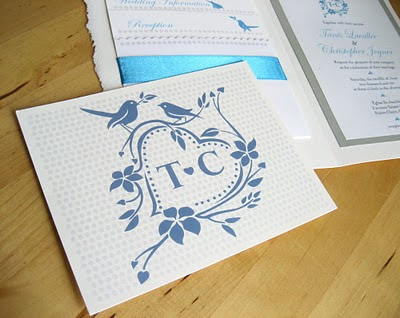
Chris and I brainstormed what we wanted to see in our invitations, we came up with: the colour blue, a "crest" design that could be re-interpreted on all of our wedding stationary, love birds, our initials and dots. It seems like a lot, but we managed to get just about everything on each page element. The front of our invitation features elements from the crest that Chris designed (which you'll see in full in a bit). We also tried to incorporate textures, the side of the card is frayed, the shiny ribbon, linen paper, contrasting textured papers... since we were doing all the work ourselves we wanted to make sure that one of the payoffs would be that we would end up saving money. It seems obvious, but trust me, once you get to the scrap-booking section of your local craft store and are staring at a wall of gorgeously fabulous shiny, sparkly, textured and super expensive papers, its very easy to get carried away! Since we weren't going to spend a bundle, we chose a few pretty papers to use in small doses for maximum impact.

The inside of the invitation is where all the info is! The right side features our crest in full along with the formal invite. The left side has an envelope with a scalloped top edge and three cards that fit neatly (and snuggly) into it; our RSVP postcard, our Wedding Information card and our Reception card. The cards all overlap to reveal just the top half inch of the card behind it, they all line up just under a row of dots. The love birds are courting each other from one card to the next.

We chose to do a postcard for our RSVP cards. Saves on the cost of an extra envelope and allowed us to get our crest printed in larger scale, of course with a polka dot background.
And of course, just in case anybody wasn't sure, we wanted to make it very clear that we made these ourselves! I mean, come on! We worked really hard, I wanted there to be no mistake as to where they came from.

Now that they are all done and mailed and there is no more invitation drama to deal with, the fun part has begun! The RSVP cards are flowing in and I love checking the mail every day! People's comments are so nice to read.


